CSS Container Queries Are Finally Here
I have been waiting for container queries since around 2018, when I first heard someone describe the problem they solve. You know the one. You build a reusable component that looks great in the main content area, but when someone drops it into a sidebar it falls apart. Before container queries, the options were media queries, which do not know about the parent, or a mess of props and computed styles that you had to thread through every parent.
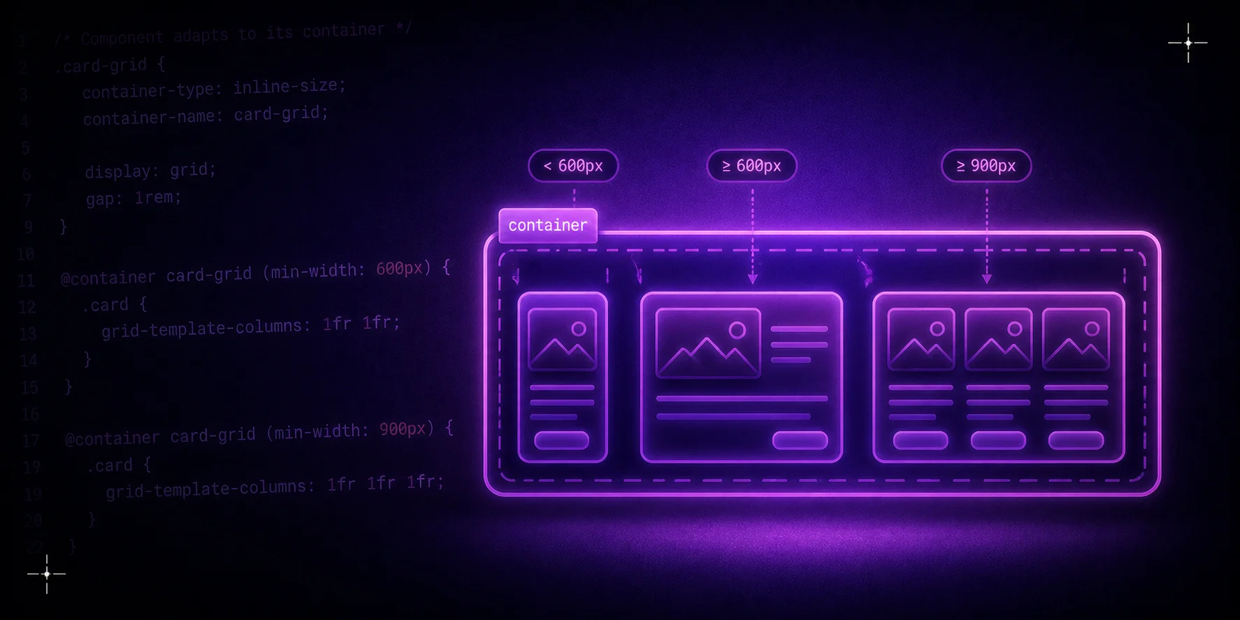
Container queries let you style an element based on the size of its parent container instead of the viewport. That changes how you think about components.
CSS.card-wrapper { container-type: inline-size; container-name: card; } @container card (max-width: 300px) { .card { flex-direction: column; } }
Browser support is solid now. Chrome shipped it in 2023. Safari and Firefox followed. Polyfills exist but I would not bother with them for most projects. The API is stable enough to use in production.
What I like most is how it changes the way you structure CSS. Instead of writing media queries that cover every possible layout, you write components that respond to their immediate container. The same component works in a narrow sidebar, a full-width hero section, or a grid cell without extra overrides.
There are quirks. You have to set container-type on the parent, and not every property can be queried. But the core use case, querying the inline size of a container, works well. I have been using it on a dashboard project for the last few months and it eliminated a whole category of bugs where the sidebar and main panel fell out of sync.
Container queries are one of those features that seem small on paper but change how you lay out a page. They make components genuinely reusable in a way that media queries never quite managed.